Two production cards are needed to represent my opening sequence. For one production company I want a font and that will reflect my genre. I went on a website called ‘Dafont’ for inspiration and came across two fonts that I liked.
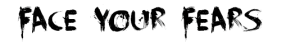
Face your fears font.
I want to have black font with either a red shadow or glow so the font has a blood-like presentation.
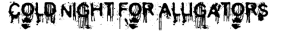
Cold night for alligators font.
I decided on the ‘face your fears’ font as I will be able to have the black font and at some red outlines. The font appears as though it has been written in blood. It was tough decision though, the hand prints could represent Zia’s hand but the title doesn’t link to the film so I decided for the other font. I can use ‘cold night for alligators’ for the actual film title font.
For my other title I want a professional look, something that is sophisticated with a picture and by the style of font.
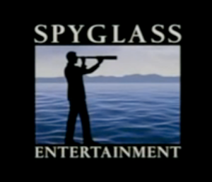
‘Spyglass entertainment’ is the font that inspired me, it is simple yet effective and has a professional and sophisticated presentation. As well as these features I want the production title that relates to the background picture. If I use a picture of mountains or trees then I want the font to reflect nature.
These fonts were found on Dafont under the ‘nature’ section.
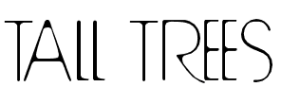
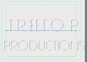
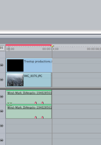
I finalised two options but decided on tall trees font as it links to the name of my production company – Treetop production.
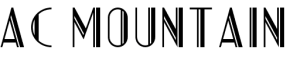
The font will ether be black or white depending on the picture I chose. As the fist title will be black font, I hope to use a white font in front of a picture in colour.