Final Editing: 6
by emilymorter
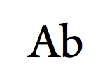
After much deliberation I decided to change my font again. This new font is basic with no colour and extortion. I still wanted to have a contrast so I decided the writing would be white. I decided to look back at my initial research and compared my title’s decision to ‘The conjuring’, I can now see how similar my latest title is to ‘The conjuring’. Hopefully this will be mean my final choice is the clearly the better choice.
Only difference being the actual font and colour choice. Yet both have a elegant font choice and contrasting foreground and background colours.
This title is more professional and looks eerie the titles fade in from black.
This is the new font, all titles are exactly 13cm and last 4 seconds. This is my final time for editing the titles. Certain titles change dramatically from scene so I added fade outs to make the changes less sharp.


